


Image by Paul Wedlake for Yellow Scene
Yellow Scene Magazine began in 2000. Not to harp on it, but we’re really proud to make it 20 years. Part of that success is our identity. You know who we are. The community knows us. Our brand is locally famous, and it was designed by Stephanie Mott. Design is everything in media.
I sat down with Stephanie on her porch, and on her swing set, in the early days of the pandemic to take some photos that I followed up with a phone call to ask about her role as YS’s first real Art Director. In “Maybe 2005 or 2006,” Stephanie begins, “I was looking for a job as a designer – I’d had jobs as a designer at a penny saver and a real estate magazine, doing really ugly ads… But it wasn’t what I wanted to do; I wanted to do design and be creative.”
Once in Colorado she “applied for tons and tons of jobs [and] got a call back from Shavonne, went and interviewed with her” and started designing. “Eventually she promoted me to art director.” And that’s where the legend begins.
Can we call it a legend? It’s definitely legendary. Let’s start at the beginning.
Stephanie has always been an artist. She went to college knowing what she liked and wanting, like most students, “to get a job and not wait tables anymore… I didn’t want to go and get a painting degree, like my husband did, and be a starving artist. I wanted to take a very practical route.”
“For my husband, as a painter,” she laughs, “his work was all about self expression and he didn’t want to sell out or whatever. My creativity was 100 percent for sale. I am completely ok with that.”
When Stephanie started, YS was a young magazine with a small team. The stories Shavonne tells are echoed by Stephanie, of the early days, with a small team trying to build something great. “When I started [at YS] it was still in Shavonne’s house,” she recalls, “we were averaging, I think, around 60 pages back then. When I left it was over 100 pages. We rebranded it, a year or two after I became art director”.
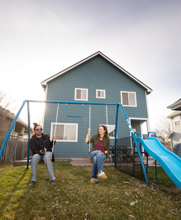
Image by Paul Wedlake for Yellow Scene
By “we” she means she executed the concepts along, with a lot of brainstorming with the Publisher and the team.
Importantly for who we are today, she was “there for the growth of the magazine, adding Brides & Babies and Home & Hood. I was there for all of it,” she says. That success early on – the growth and the ability to define the magazine through graphic identity – came down to Shavonne’s vision for YS, and Stephanie’s execution and management. “I don’t know if saying I ran [the art department] with an iron fist would be too strong,” she laughs.
We may be a little laissez-faire nowadays, but the iron fist was definitely needed back then. “The workload is so incredibly massive,” she remembers, a fact I can attest to. “You have to be extremely efficient to get it done and get it done by deadline. I made a lot of rules, a lot of procedures. There’s just no other way to get that much work done. Lots of arguing with Shavonne about deadline.”
After all is said and printed, design was the goal. Good design. A legacy of design that stays with us. In the last 3 years alone we’ve easily won a dozen design, layout, and photography awards. What stands out as a notable design to one of our greatest designers? It’s funny what she remembers.
“Back when there was myself and Andra, we did the HOT Issue and we did a romance novel spoof. So everything was very tongue-in-cheek and suggestive, all the writing, and we did a cover that looks like a cheesy romance novel. That was a good one. I loved the pet issues, the food issues were fun.”
Speaking of Andra, and with a nod to myself in the current era, Stephanie gives credit, saying, “A good editor can make you better.”
Today Stephanie is the creative director for the Y of Northern Colorado. Her work is in “trying to guide the brand to all the employees that do not work in marketing.” The experience cultivating a brand, managing an art department, the toil of it all…much of that was learned here at YS. The irony of Stephanie moving from YS to the Y, minus Shavonne, isn’t lost on us during the conversation.
YS was designed by Stephanie. “I’m surprised they haven’t changed much,” she says. I’m not. The design is timeless, it speaks to us, it’s still us. In seeking inspiration for the special sections and our regular columns, designs that were her creation, she says that it’s” an efficiency thing” and it helped to define YS for the future. Who doesn’t see the yellow YS logo and know exactly who we are? It’s the same at the Y, she says. “That’s one of the nice things about the Y brand. It’s a national brand, every Y in the country, 2800 Ys. We all follow it.”
And YS? We follow Stephanie.
[direct-stripe value=”ds1585187109306″]